
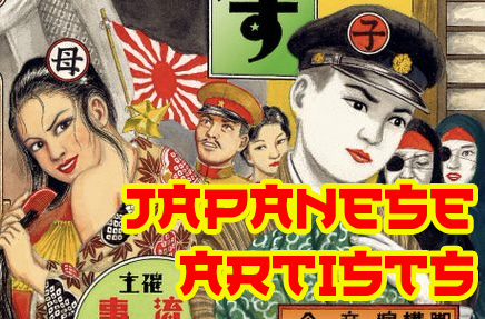
I will be visiting Japan for the fourth time this year, and one of the things I’m most excited about is hunting down books by my favourite Japanese artists. Japan has an incredible art and illustration culture, and I always come home with a suitcase a little heavier than I planned.
On every trip I try to track down artist monographs, exhibition catalogues, or small independent publications that are difficult to find outside Japan. I’ve made a shopping list of artists whose work I admire—from dreamy pop-surreal painters to illustrators from decades past.
Here are some of the artists on my list, along with a little information about each of them.
Awazu Kiyoshi (1929-2009)
Awazu Kiyoshi was a pioneering Japanese graphic designer who helped define the aesthetics of Japanese graphic design in the 20th century. Known for his bold, visual language with acid colors that blended typography, folklore, and political commentary. Working in the postwar era with his anti-establishment message, he was primarily known as a poster artist, but also dabbled in book design, public signage, and environmental art. His Japanese theatrical posters, inspired by Edo-/Taishō-era prints but with modern pop-art flair are particularly important because it showed his support of avant guard theater. Think pop-art with a ukiyo-e (floating world) Edo period, wood block art fusion. He illustrated a lot of art magazine covers.
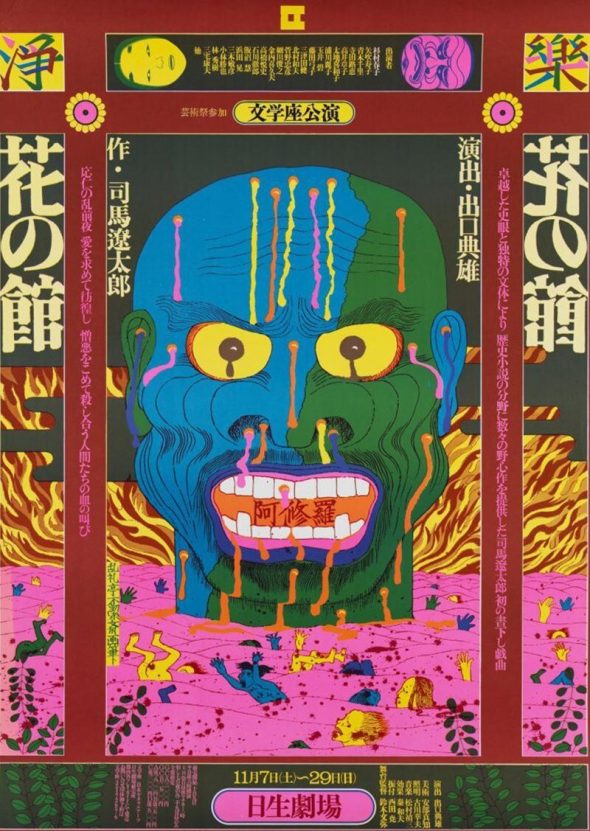
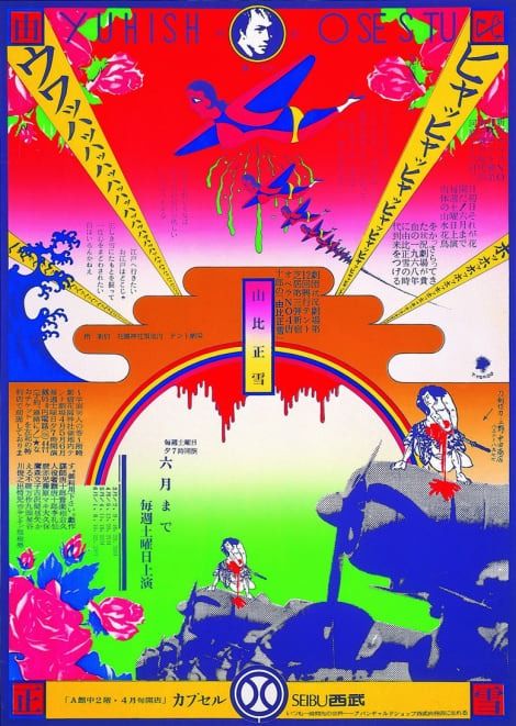
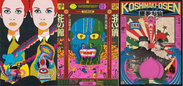
I was able to find out some information about this image. This is a poster for a play, called, “The Wife of Hanaoka Seishū” based on a well-known Japanese historical novel. It’s based on the life of Hanaoka Seishū, Japan’s first surgeon to use general anesthesia, the story weaves in a tragic rivalry between his wife and his mother, both of whom suffer greatly in support of his medical experiments.
Possible symbology of the imagery
- The crow (karasu ) – often symbolizes death, fate, or sorrow in Japanese culture.
- Tears, moon, bats – evoke tragedy, emotional suffering, and night.
- Flowers (morning glory-like forms) – fleeting beauty, endurance, or sacrifice.
- Human figures diagram (top right) – likely symbolic of medicine/anatomy.
The poster’s dark imagery reflects: sacrifice, female suffering, science vs. humanity and silent endurance which perfectly illustrate to the public what to expect from the play.
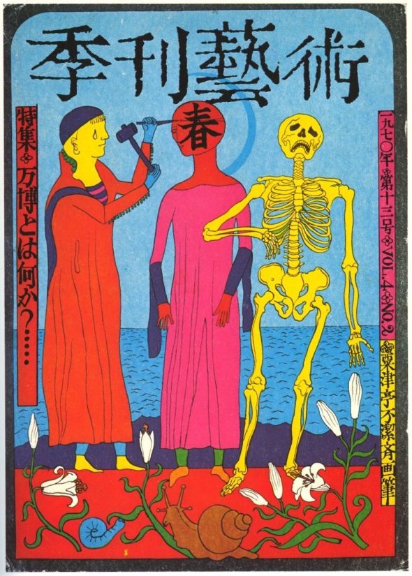
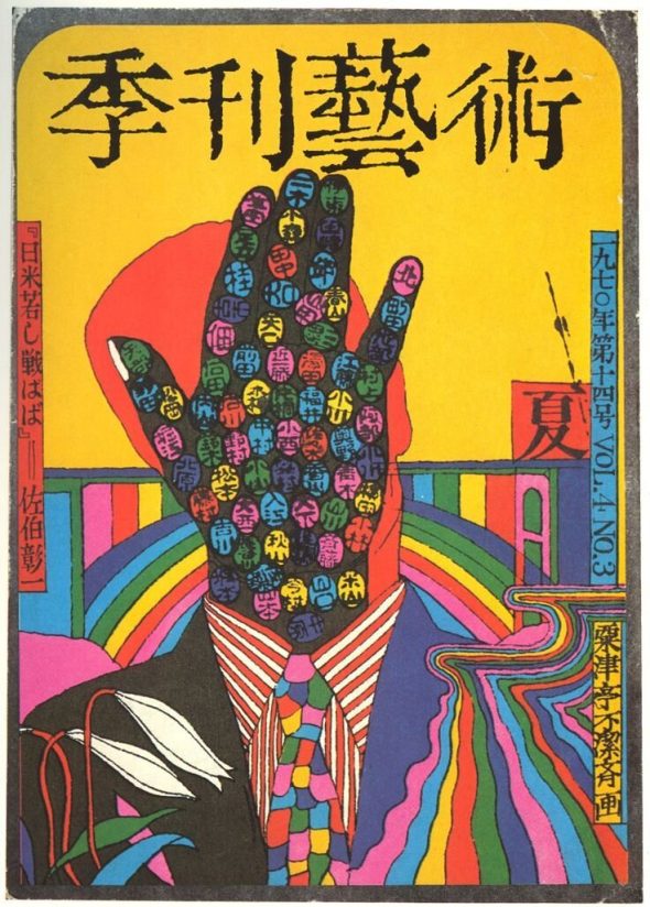
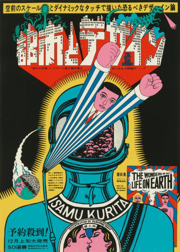
This is another graphic poster, styled like an avant-garde art/medical magazine cover. “Art Quarterly”
Imagery explanation
- Artist hammering a figure’s head → art as construction, intervention, or violence
- Human figure turning into a skeleton → mortality, science, anatomy, or critique of progress
- Spring + flowers + snail → life cycle, rebirth, slow change
- Bright colors + skeletal anatomy → pop art mixed with medical illustration
This fits perfectly with 1970s Japanese avant-garde art, especially around the Osaka Expo ’70, when artists questioned technology, modernity, and the human body.
Keiichi Tanaami (1936-2024)
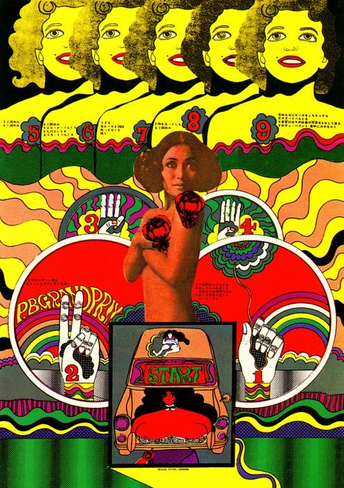
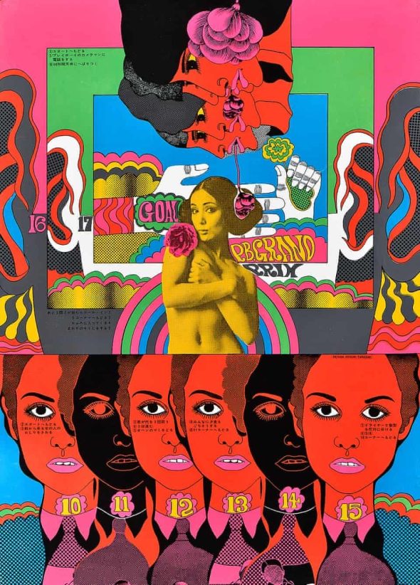
Keiichi Tanaami is a major figure in Japanese pop art whose psychedelic imagery draws on personal memories, postwar trauma, cartoons, and American pop culture. His work is instantly recognizable for its hyper-saturated colors, dense compositions, and hallucinatory layering of imagery.
Tanaami’s childhood experiences had a profound impact on his visual language. As a boy he witnessed the devastating firebombing of Tokyo during Bombing of Tokyo, and the memory of burning skies and destruction would later reappear in surreal and symbolic ways throughout his work. Explosions, flames, and fragmented landscapes often sit side by side with playful or nostalgic imagery, creating a strange mixture of trauma and pop spectacle.
Beginning in the 1960s, Tanaami became active across several disciplines including graphic design, animation, illustration, and fine art. Like many artists of that era, he was fascinated by mass media and the visual language of advertising and comics. In his early works he frequently incorporated photographic collage, blending images from magazines and popular culture into layered compositions. These pieces reflected both the influence of American pop art and Japan’s rapidly changing postwar visual culture.
Over time his work evolved into the unmistakable hand-drawn psychedelic style for which he is now best known. Later paintings and illustrations became increasingly intricate and surreal, filled with hybrid creatures, dreamlike landscapes, and wildly imaginative figures. His drawings often feel like vivid dreams or fever visions, packed with symbols, bright colors, and swirling forms that seem to spill across the surface.
In his later work he also explored erotic imagery more openly, combining sensual figures with his characteristic psychedelic motifs. The results are both playful and unsettling, blending sexuality, humor, nostalgia, and surreal fantasy into a dense visual universe.
I own a beautiful 256-page monograph of his work published by Rizzoli International Publications, which gives a fantastic overview of his long and varied career. Seeing so much of his work collected in one place really shows how experimental and prolific he was across different media.
Shortly before his passing, Tanaami was honored with a major retrospective at The National Art Center Tokyo. The exhibition celebrated more than six decades of his work and confirmed his status as one of Japan’s most influential experimental artists.
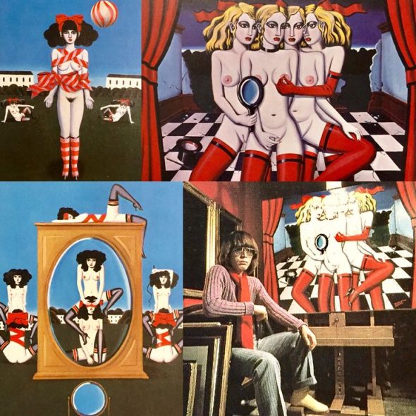
Tadanori Yokoo (b. 1936)
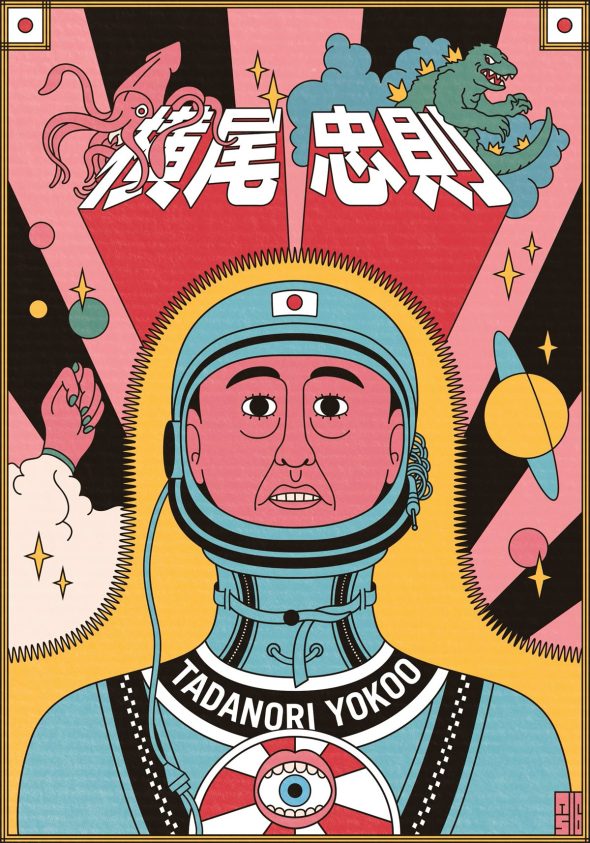
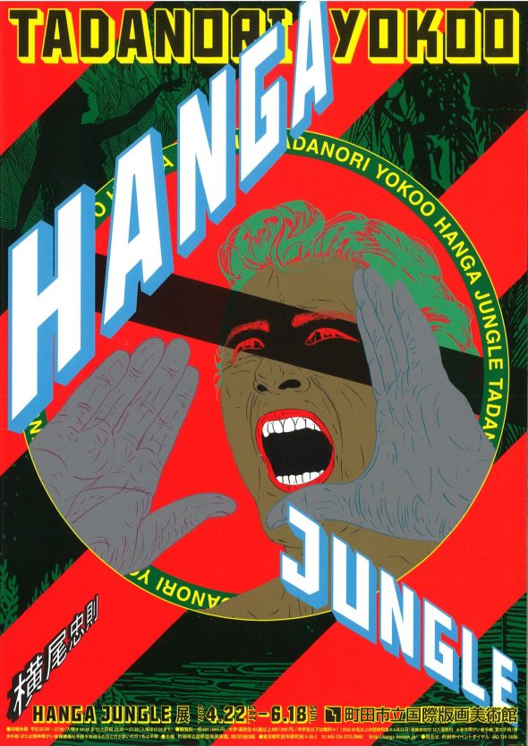
Tadanori Yokoo’s work is instantly recognizable for its vibrant colors, dense compositions, and collage-like layering of imagery drawn from pop culture, religion, politics, and traditional Japanese symbolism.
He first rose to prominence in the 1960s with a series of striking posters created for avant-garde theater productions, underground films, and experimental music performances. At a time when Japan’s counterculture was flourishing, Yokoo’s bold graphic language—combining pop art, psychedelia, advertising imagery, and surreal humor—captured the energy of the era and helped define its visual identity.
Many of his works feature recurring motifs such as the rising sun, Mount Fuji, bullet trains, and iconic figures from both Japanese history and Western pop culture. These elements are often arranged in dizzying, almost vortex-like compositions that feel chaotic and dreamlike. His drawing style sometimes has a deliberately naïve, cartoon-like quality, which contrasts with the complexity of the symbolism and references layered throughout the image.
In the 1980s Yokoo shifted his focus from graphic design toward painting. This transition marked a new phase in his career, where his imagery became more introspective and symbolic while still retaining the exuberant color and visual intensity of his earlier poster work. His paintings often feel like strange dreamscapes—part autobiography, part cultural collage—where memory, mythology, and fantasy overlap.
His work is held in major museum collections around the world, and he remains one of the most recognizable voices in Japanese visual culture.
Remarkably, Yokoo continues to create prolifically well into his later years. His long career and restless experimentation have made him a landmark figure in both Japanese and global contemporary art.
There will also be a new monograph on his work published by Thames & Hudson scheduled for release in June 2026, which I’m hoping to add to my collection.
Another testament to his influence is that he even has his own museum: the Yokoo Tadanori Museum of Contemporary Art. The museum holds a large collection of his work and regularly stages exhibitions exploring different phases of his long and prolific
Telling the Difference
These first three artists really defined the visual language of 1960s Japanese graphic design, and they share many of the same cultural symbols.
The graphic design explosion in Japan during the 1960s produced a distinctive visual style that blended Western pop art with traditional Japanese imagery. Because many designers were working with similar visual codes, it can sometimes be difficult to tell their work apart.
Three of the most important figures from this period are Tadanori Yokoo, Keiichi Tanaami, and Kiyoshi Awazu. Although they share certain visual references, each developed a very distinctive approach.
Tanaami: psychedelic collage and photomontage
Keiichi Tanaami often incorporated photographic imagery and photostats into his work during the 1960s. His compositions feel dense and hallucinatory, layering images from magazines, advertising, cartoons, and American pop culture. The result is a kind of psychedelic collage where photography, drawing, and graphic elements blend together. His work often has a surreal or dreamlike quality, reflecting both the influence of pop art and his own personal memories and imagination.
The work of Kiyoshi Awazu feels closer to traditional Japanese visual culture. His posters often echo the flat planes, bold outlines, and compositional balance found in classical woodblock prints, particularly those of the Ukiyo-e tradition. At the same time, Awazu incorporated contemporary imagery and experimental typography, creating designs that bridge historical Japanese aesthetics and the modern graphic language of the 1960s.
The work of Tadanori Yokoo is perhaps the most immediately recognizable. His posters often feature naïve, almost childlike drawing, combined with a dizzying arrangement of symbols and references. Recurring imagery such as the rising sun, Mount Fuji, trains, performers, and historical figures appear in vibrant, chaotic compositions. His style mixes psychedelic color with humor, surrealism, and theatrical spectacle, making his posters feel like strange visual dreamscapes.
Despite their differences, these artists were all responding to the same cultural moment. Postwar Japan was rapidly modernizing, and designers were absorbing influences from American pop art, advertising, and psychedelic culture while also rediscovering traditional Japanese imagery. The result was a bold new graphic language that was unmistakably Japanese yet deeply connected to global counterculture.
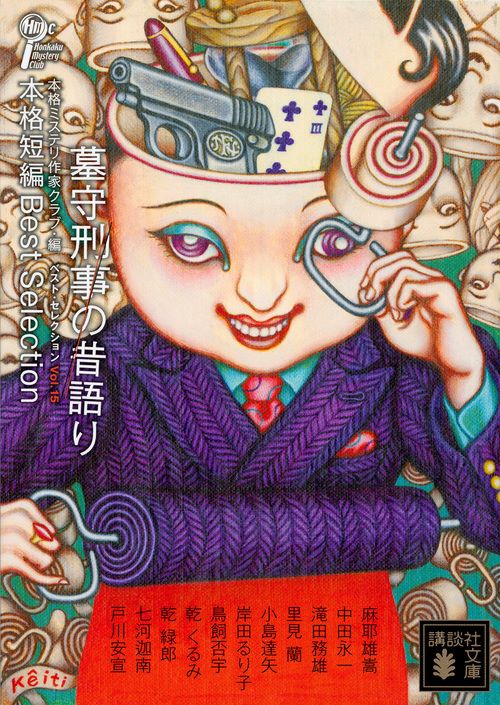
Suehiro Maruo
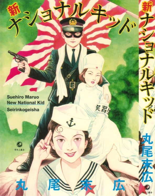
Suehiro Maruo is a cult Japanese manga artist celebrated for his contributions to the erotic–grotesque «ero-guro» visual culture. His finely detailed, woodblock-influenced drawings explore dark, theatrical themes inspired by early Shōwa-era decadence. He illustrated Shōjo Tsubaki—often translated as The Camellia Girl or Mr. Arashi’s Amazing Freak Show— a famous Japanese underground manga. It represents a cornerstone of Japan’s countercultural art scene, influencing many of my contemporary artist friends. There is a film/play adaptation of the graphic novel/manga.
Taro Okamoto (1911–1996)
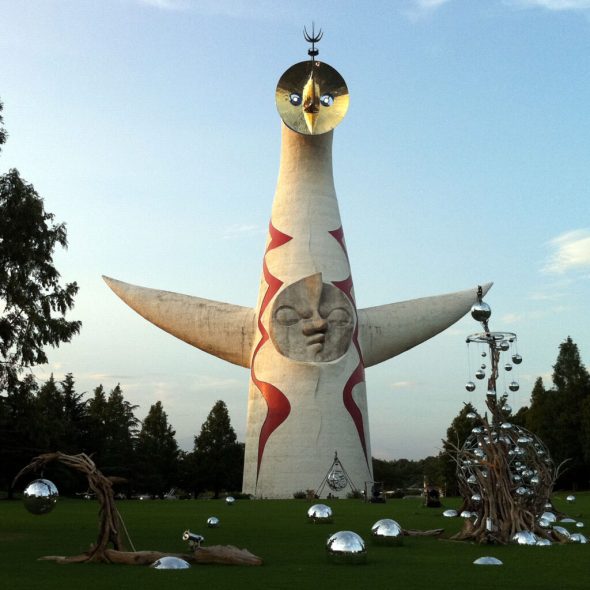
Taro Okamoto was one of Japan’s most iconic modern artists, celebrated for his energetic abstract style and the slogan “Art is Explosion!” Influenced by Surrealism and ethnology, he produced paintings, sculptures, and public monuments—most famously the Tower of the Sun, for the World Exposition Osaka 1970—that became a symbol of postwar Japanese creativity. He was a member of Acéphale, George Bataille’s secret society. He lived and studied in France at the Sorbonne under Marcel Mauss and Paul Rivet, and later had a residency at the laboratory of the musée de l’homme in Paris where he focused on ethnology. He spoke fluent french.
Kuniyoshi Kaneko (1936–2015)
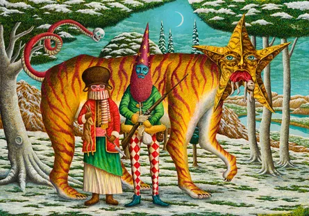
Kuniyoshi Kaneko was a painter and illustrator known for his elegant, Gothic-romantic depictions of women, often blending Victorian aesthetics with surrealism. His distinctive style made him a leading figure in late-20th-century Japanese fantasy art, influencing fashion, theatre, and pop culture. His paintings are populated by candy eating Lolitas, Alice in Wonderland obsessed teenagers, and fetish themes. I see heavy English/England influences. Using a restrained color palette of mainly red, pink, black and blue, his style is immediately recognisable.
Oota Keiticle (Ota Keiticle)
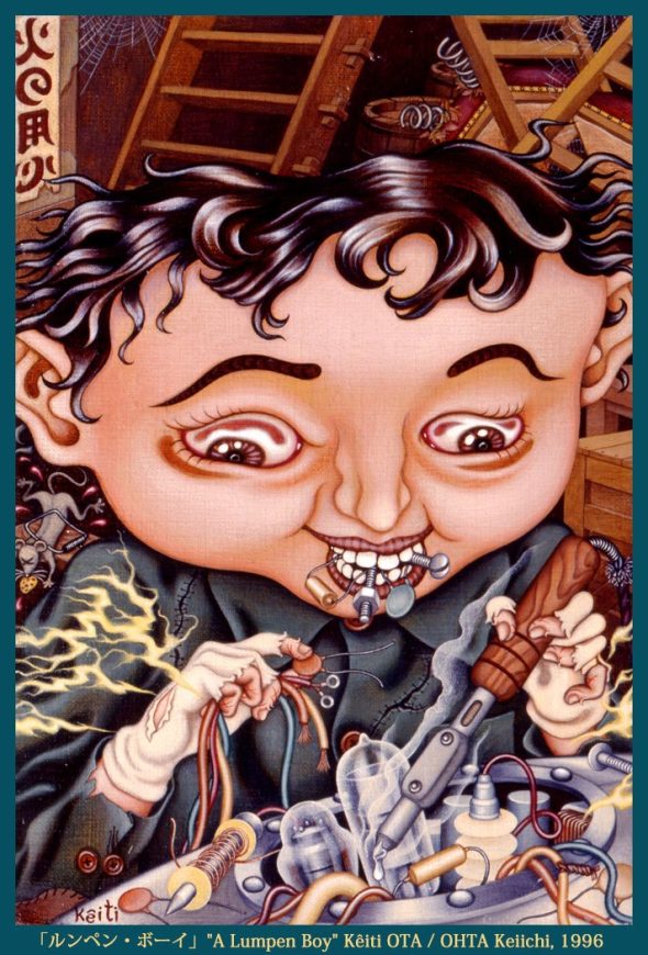
Oota Keiticle is a Japanese illustrator and designer associated with Tokyo’s underground art and vintage fashion scenes. His work features sharp linework, bold compositions, and darkly playful characters. Often depicting big eyed children, he draw from punk culture, manga, and street aesthetics, often blurring the line between graphic design and fine art.
Yui Sakamoto (1981 – 2024)
I met Yui Sakamoto because he lived in the same town in Mexico as my mother, San Miguel de Allende. He was a contemporary Japanese illustrator whose work combines soft, pastel palettes with subtly unsettling imagery. Often depicting young figures and dreamlike scenarios, his art explores themes of innocence, vulnerability, and psychological tension, balancing sweetness with quiet unease. He passed away suddenly in 2024 leaving behind his widow and 5 children.
Junko Mizuno (b. 1973)
Junko Mizuno is a Japanese artist and manga creator best known for her bright, cartoonish style paired with dark, adult themes. Drawing from shōjo manga, horror, and pop surrealism, her work reimagines fairy tales and folklore through a lens of feminism, humor, and grotesque fantasy.
Yoko d’Holbachie
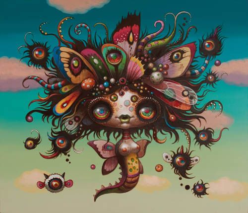
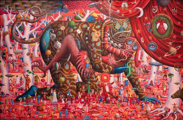
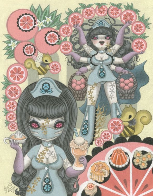
Yoko d’Holbachie is a Japan-based artist working more recently, whose art blends surrealism, fashion illustration, and fantastical storytelling. Known for her elegant yet uncanny figures, she creates richly imagined worlds influenced by mythology, Gothic romance, and contemporary visual culture. You will recognise her work through the saturated colors and big eyed girls and alien creatures. Her dreamlike environments that feel both playful and slightly uncanny. Her paintings often look almost digitally rendered or sculpted, even though they’re traditional paintings. Through meticulous gradient shading and saturated color, she constructs highly volumetric forms that feel almost sculptural despite the flat painted surface. Her figures appear rounded, glossy and inflatable, as if modeled in 3-D, almost like toys or balloons, giving the paintings a dreamlike, hyper-dimensional quality reminiscent of lucid dreaming.
Superflat
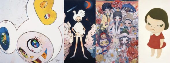
Superflat is a contemporary Japanese art movement that emerged in the late 1990s, theorized and popularized by artist Takashi Murakami. The term refers both to a visual style—characterized by flat planes of color, sharp outlines, and polished surfaces—and to a cultural critique of postwar Japanese society.
In his manifesto Murakami traced Superflat’s roots to traditional Japanese art forms such as ukiyo-e woodblock prints, which emphasized flatness and decorative surfaces, as well as to manga and anime, whose aesthetics dominated postwar popular culture. He argued that Japan’s experience after World War II—particularly the lacune of hierarchies between “high” art and “low” commercial imagery—produced a culture where fine art, consumer goods, and otaku subcultures exist on the same plane.
In the early 2000s, Superflat gained international visibility through exhibitions such as Superflat (2000) and Little Boy (2005). Artists associated with the movement, including Yoshitomo Nara, Aya Takano, and Mr., explored themes of cuteness, sexuality, violence, and fantasy, often masking darker psychological or social commentary beneath playful imagery.
Beyond style, Superflat functions as a critique of consumerism, infantilization, and cultural emptiness in late-capitalist Japan. Its influence extended globally, shaping contemporary pop surrealism, fashion, and design, and redefining how popular culture could operate within the fine art world.
The manifesto of Superflat greatly inspired my first manifesto, Cannibal Bonbon.
Nanzuka (Contemporary Gallery)
Nanzuka is a Tokyo-based contemporary art gallery known for championing avant-garde, subculture-influenced, and pop-surrealist artists. It plays a major role in connecting Japanese underground aesthetics with global contemporary art through exhibitions, collaborations, and international fairs.